In this article we report two examples of a Feng Shui harmonization of an irregular shaped flat (Pic.1): the first in the bedroom, the second in the living-room.
According to Feng Shui the best shape for a house – or a flat – is a box or a not very oblong rectangle. In that case we can really have a rational arrangement of the space, but when a flat has an irregular shape we can find several problems.
BEDROOM
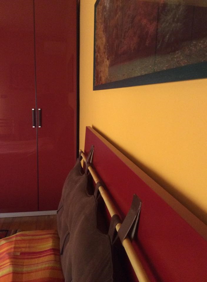
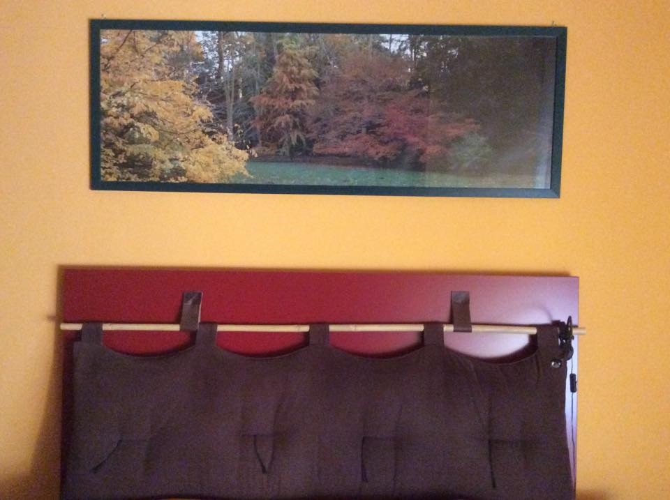
The first example concerns the bedroom, which has a south-west orientation. The color of the wardrobe and of the headboard is reddish purple and expresses a Fire energy (Pic. 2) while the color of the wall, the picture over the bed and the futon headboard (Pic.3 – furnishing bywww.cinius.com) have a predominance of Earth colors (yellow, dark brown, red brown): this allows us to create a harmonic binomial aligned with the south-west area (Direction Earth 2 of Ba Gua).
In front of the bed there is another naturalistic poster with water flowing outward so that you can picture a movement along the wall – even though virtually – which can help to neutralize any possible disturbances from the room of the neighboring flat (Pic. 4).
In order to reinforce this solution two orthogonal mirrors (Pic. 5) have been placed in a high corner of the room such as to send back any images beyond the two external walls (in red in pic.1) delimiting two ‘outer’ rooms – from the point of view of the actual map – but ‘inner’ in relation to an ideal rectangular shape (In green in pic.1)
This is a way to enlarge the view projecting the images coming from inner spaces towards two outer spaces which are responsible for a narrowing of the ideal rectangular shaped map.
LIVING-ROOM
The second example is about the south-west oriented living-room. Here the binomial is between Wood and Fire energy. In picture 6 you can see how the predominant Wood color is green – the sofa cover, the pillows and the plant – while Fire is represented by the lively chromatism of the Indian wall hanging and the African style patchwork (design and build by reoattitude.com). The latter is endowed with a geometric effect imitating the oblique line of the staircase along the wall: the setting of a triangle overlapping a rectangle suggests a smaller trapezoidal space. The triangle’s tip has also the purpose of resolving the flattening of perspective due to this second external wall, pushing it upwards.


